Is Columbia, MO’s new flag design just an image of four men sitting in a hot tub? Or is it a well-crafted reflection of the community, utilizing the great principles of flag design? Leave it up to Caledon Virtual’s Art Director, Alicia Troesser, to provide a friendly and candid critique of Columbia’s new flag.
On Monday, May 2nd the City Council officially adopted and approved the new city flag for Columbia, MO. The chosen design – out of 84 submissions – is nothing short of “what you unexpect.”
What’s in a flag?
A great flag design connects people to its city, and a city to its people. It reflects the value of design in a community – design that reflects the care and love for a city’s people.
It’s hard to believe that a rectangle piece of fabric composed of a few abstract shapes can be so powerful. Flags represent the historic past, present, and future. I can remember sitting in my 3rd grade classroom listening intently as my teacher, Ms. Plum, introduced us to the story of Betsy Ross, the original 13 colonies, and the creation of the United States flag and the representation thereof. I imagined a cute old lady, probably someone like my grandma, cutting and sewing together 13 stars and stripes as George Washington stood across the sewing table giving his nod of approval. That 3rd grade history lesson taught me the power of symbols and instilled in me a sense of passion and loyalty to our country and all that our flag stands for.
Pair those 3rd grade sentiments with a musical arrangement of the National Anthem before a Cardinals game today, and I can’t help but feel an overwhelming sense of pride and nostalgia.
Flags unite communities, instill pride, passion, and loyalty.
Although Columbia’s new adopted flag won’t immediately conjure up the same feelings of loyalty and pride as the American flag, it should capture the essence of our beautiful city. Before we dive in let’s take a look at what makes up a great flag design.
- Keep it Simple
- Use Meaningful Symbolism
- Use 2-3 colors
- No Lettering or Seals
- Be Distinctive
Here are a few examples of successful flag design:
Kansas City, MO

Chicago, IL
Indianapolis, ID

And some not so successful:
Jacksonville, FL
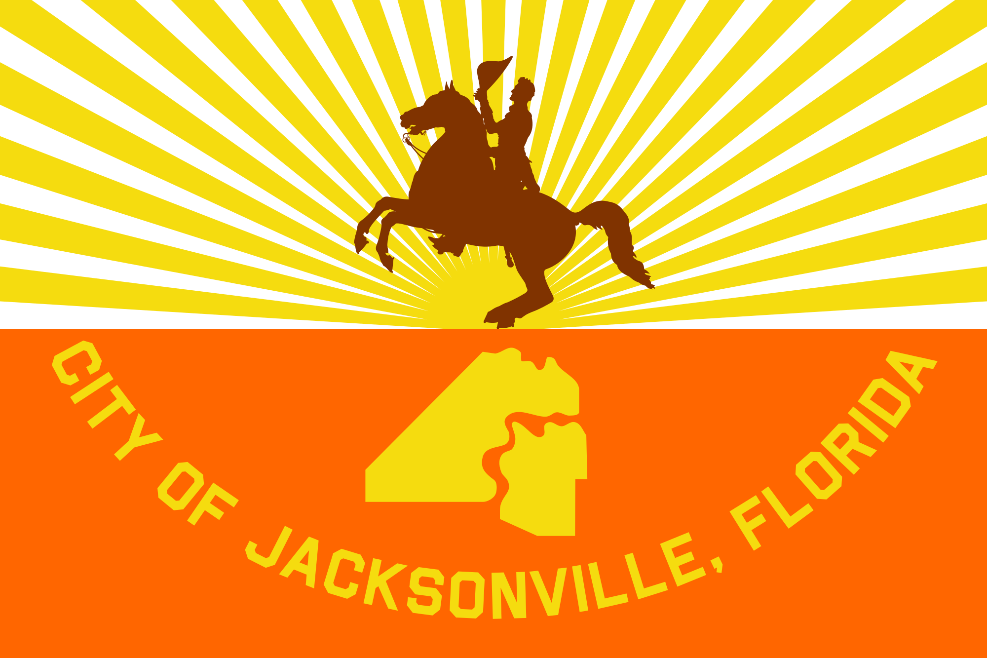
Anaheim, CA
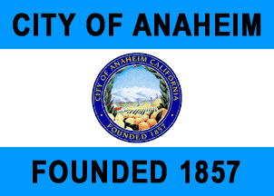
New York City, NY
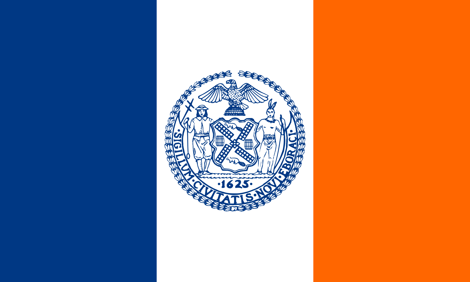
So how about Columbia’s new flag? I’d say it falls somewhere in the ‘average’ category.

It follows 3 out of the 5 basic flag design rules:
- KEEP IT SIMPLE: Check.
Yes, the Columbia flag is very simple – 2 colors and 1 white cross, with the city logo in the middle, outlined in a thin white stroke. - USE MEANINGFUL SYMBOLISM: Check.
Every element of the flag is a symbol that represents some aspect of Columbia. The white cross represents Columbia’s middle-of-the-state location. The blue color represents rivers, creeks, and lakes. The green color represents nature areas. The city logo, in the middle of the flag, represents the diversity of our town and the unity of Columbia’s citizens. Even though the different elements of the flag symbolize the main components of our city – I think it could be done in a more effective way (like not using the logo to represent diversity and unity – see #4) - USE 2-3 COLORS: Check.
Blue, Green, White. The blue and green tones could have been adjusted ever so slightly to create more contrast between the 2 colors. (Imagine the blue leaning more towards a navy blue or the green having an earthier tone – much better right?) - NO LETTERING OR SEALS: X.
Including the city’s logo was a bold decision. Logos evolve with time. What happens if the city decides to update or refresh the logo 10 years from now? Do they redesign the flag? Unless the logo is here to stay for another 25+ years, I would have liked to see a more abstract approach to create distinction in the flag rather than the city logo being the most prominent feature. - BE DISTINCTIVE: X.
The simplicity of the design is a strength but also a weakness – the flag design lacks distinctiveness.
Love it or hate it – it will likely not change the love the people of Columbia have for this beautiful city.
P.S. Once you see the 4 men relaxing in a hot-tub in the Columbia logo, you won’t be able to see anything else.